Project: Spotify wants to improve engagement and retention in the app by expanding on their social capabilities. In this project, my role was to help them define the best way moving forward in that direction.
Target user: A diverse and broad demographic of current and potential Spotify users
Goals: Design a new social feature that integrates seamlessly within the current Spotify mobile app.
My role: Researcher and UX Designer
Tools used: Pen and paper, Photoshop, Sketch, InVision
PROCESS
RESEARCH
This project was very research heavy. I began this research by first conducting secondary research on Spotify and streaming music services in general. As I found through this mode of research, streaming music services are responsible for 62% of all U.S. music industry. This number is attributed to the strong growth of Spotify and other services. Spotify currently has 140 million active users, 60 million of which are paid subscribers. There are 2 billion user-created Spotify playlists, 5 million of which are created or edited daily. 52% of Spotify listening takes place via the mobile app, while 38% is on the desktop, and 10% on tablet.
After finding key statistics and information, I dove into downloading and researching the features of Spotify and its competitors myself. Some of the social features already available on Spotify for users are the ability to sync with Facebook, the ability to share songs and playlists through third party social media platforms, the ability to collaborate on playlists, and the ability to see what friends are listening to by looking at the "friend activity" feed (available on desktop only).
Earlier this year, Spotify removed its Inbox/Messages feature, citing extensive data analysis showing very low engagement amongst users. The removal of this feature caused some outrage amongst some Spotify users, many who found it useful. All previous messages were deleted once the feature was removed, with no way to access old message exchanges. Spotify stated that it would like to focus efforts on improving existing features.
Spotify's competitors include Apple Music, Google Play, SoundCloud, Pandora, Tidal, iHeartRadio, Amazon Music Unlimited, and several others. After analyzing each one, I personally felt that Spotify already had a leg up in terms of sociability.
The next step, however, was to hear from Spotify users themselves by conducting interviews. These interviews provided me with valuable insights and perspectives on the social features of Spotify. I was able to learn more about habits and pain points of Spotify use, specifically how it relates to connecting with others.
I found it really interesting that so many interviewees were not aware of Spotify's current social features. For those who are aware, they are simply not interested in seeing what their friends are listening to song-by-song, nor do they want others to see what they are listening to. A lot felt that at times, their music listening is very personal, but they had no issue sharing songs and playlists with others at other times. In fact, many enjoy sharing music with friends and "sharing the love." Many feel that sharing music brings people together. To me, it seemed like they just want to make sure song sharing is done on their terms and not automatically. I felt that this was a subtle, yet key point to take into consideration moving forward.
Another thing I found interesting was the frequency in which people choose to use YouTube instead of Spotify when sharing songs with others off of the app itself. I felt that there could be a way to streamline this. Overall, I found these interviews really eye opening and helpful in pinpointing key elements that could be enhanced on Spotify moving forward.
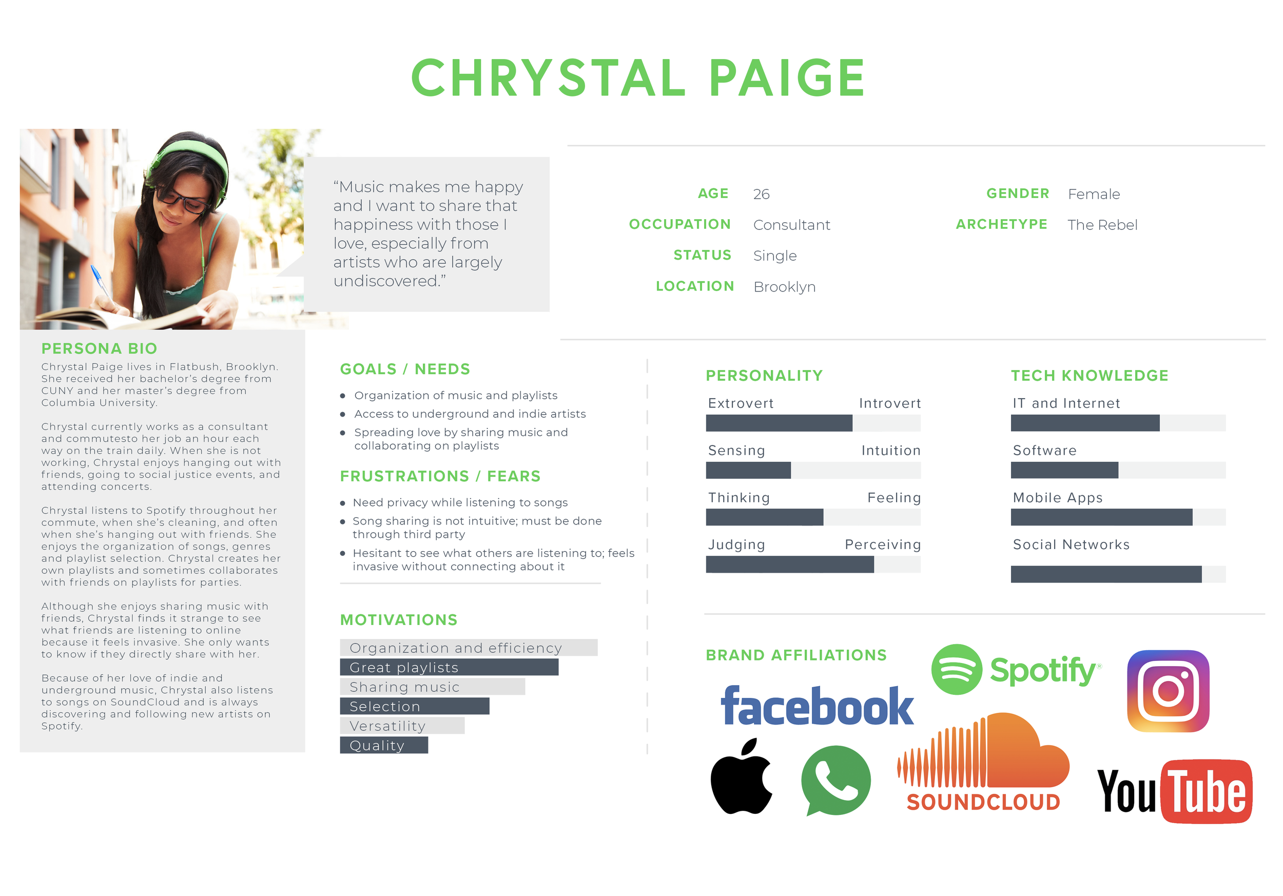
The secondary analysis and interviews helped me to create my persona, Chrystal Paige. Chrystal is a 26-year-old music lover and avid Spotify user. She often looks for underground and indie artists and enjoys sharing undiscovered music with others.
Persona created for the Spotify project
INFORMATION ARCHITECTURE
After the research phase, I ended up in an ideation brainstorm, writing out several ideas for social features. One of the ideas I liked at first was having a social feed, similar to Venmo, where Spotify users can see song, album, and playlist exchanges of their friends on the home screen. I ended up throwing out this idea because it strayed too far away from the current Spotify app, and my role was to make a feature that would fit in seamlessly.
I settled on the idea of creating a way to share music within the Spotify app, done subtly within the current interface. I also added a way for users to keep track of the songs shared by them and with them. Below is the final application map I ended up with.
Application map for Spotify Share
INTERACTION DESIGN
After the application map, I created a user flow by identifying the main flow that users would follow in order to use the Spotify Share features. The user flow was based on the persona Chrystal, showing the path she took to share her song.
User flow
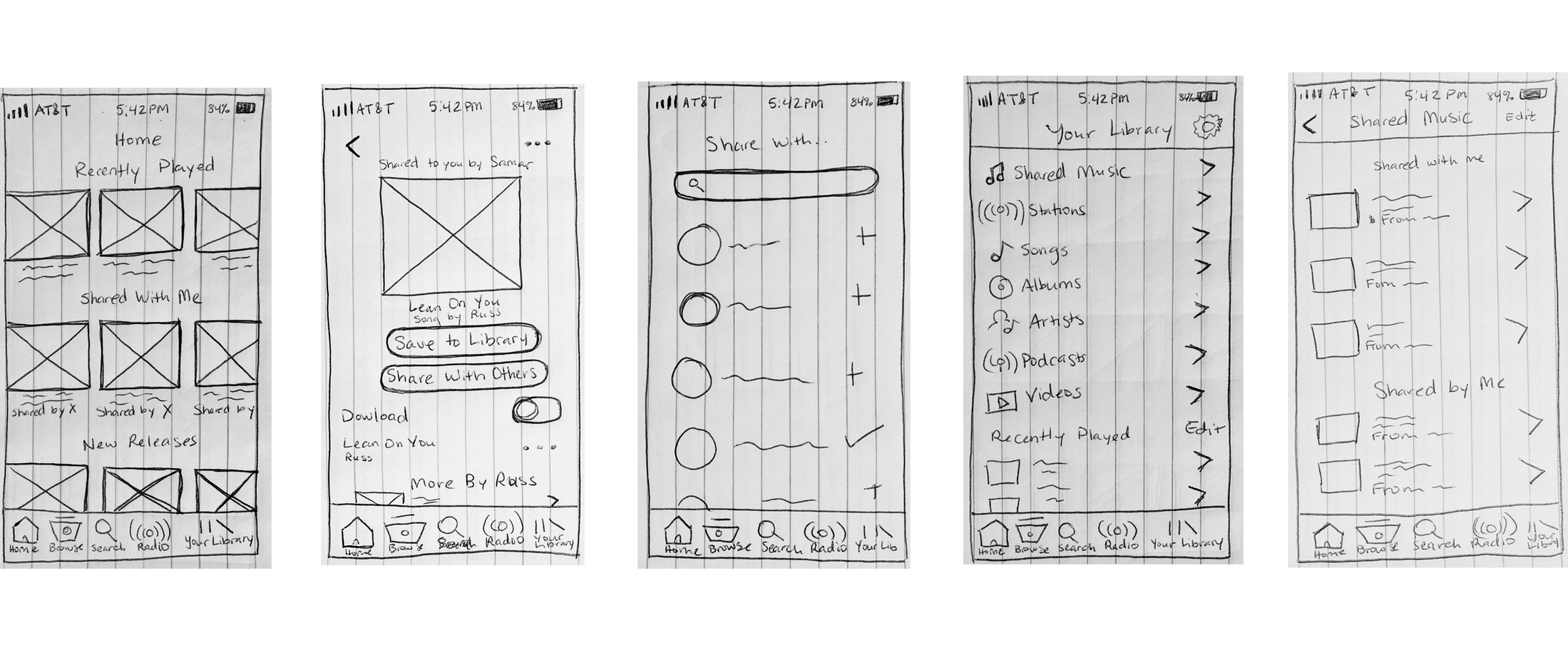
Following the user flow, I created very low fidelity wireframes for Spotify Share to see what it would look like on screen. Below are sketched out wireframes I decided to go with. I ended up featuring the recent shared songs on the home page to give a bit more awareness to the feature, since many users during the interview phase weren't aware of many of Spotify's current social features.
Initial Spotify Share lo-fi wireframes
UI DESIGN
The last step in the process was the user interface. Since Spotify already has their own user interface, my challenge was to implement my Spotify Share feature in a subtle way that fit well with the current platform's look and feel, rather than creating my own UI kit, as I have in previous projects.
Based on my wireframes, I created a high fidelity prototype that I felt fit in well with the current platform. I tested it out with users and found some areas where I strayed away too much from the current design, and iterated until I felt like I got it right. After some changes, here is the link to the final hi-fi prototype I came up with for the Spotify Share feature.
Some the screens for the mobile Spotify Share feature
SUMMARY
Working on this project was a very humbling experience. Although I had many big ideas, I had to scale things back and be able to learn how to design within the confines of an existing platform, creating solutions in ways that benefits both Spotify and its users.
I spent a lot of time in the research phase of this project. I was motivated to really dig deep into the needs and pains of users that could be solved through a social feature.
Although the social feed idea I initially had would have been fun to do, thinking back at the interviews, many users didn't necessarily want Spotify to be like a social network. Neither does Spotify. I felt like the Spotify Share feature I created was a more subtle addition that fits in with the current platform, and an option people have that will allow them to share the music they love. In doing so, there's a strong potential for users to deepen their connections with others and to further engage with the Spotify app.
Overall, I felt like this project was a success. Users really liked the feature and said they would love to use it. It was definitely a challenge to be able to work within these confines, but it was a much needed learning experience.


