Project: Conqr is an app that provide tools to and empower those experiencing cancer by having their health information in the palm of their hands. I was responsible for designing Conqr's end-to-end mobile app and branding.
Target user: Those receiving treatment for cancer and their caretakers
Goals: Design mobile app, logo, and branding
My role: UX and UI Designer
Tools used: Pen and paper, Adobe Photoshop, Sketch, Illustrator, InVision
PROCESS
RESEARCH
I started this project by doing some background secondary research, focusing on key statistics and facts about cancer, who gets it, and the many complexities of coordination of treatment.
Approximately 40% of men and women in the U.S. will be diagnosed with cancer at some point in their lives. Cancer affects people from all walks of life, young and old. Cancer is often treated in one or more of the following ways: surgery, chemotherapy, radiation, targeted therapy, stem cell or bone marrow transplant, immunotherapy, and clinical trials. Cancer patients often must manage a range of physical and emotional side effects. Managing cancer requires a strategic approach that combines effective prevention with meaningful and timely access to treatments that can either cure the disease or significantly extend life.
During the secondary research phase, I also looked into information about health-related mobile apps, which I found are growing exponentially. I also explored different online platforms that address issues related to cancer specifically.
Along with the information found in secondary research, I conducted interviews with cancer patients, survivors, and caretakers. Although I have personally experienced cancer myself, this process was extremely valuable and really deepened my awareness of everyone's various needs and pain points. One thing the majority of interviewees are frustrated with is needing to manage multiple symptoms and side effects of treatment. Another is the lack of organization of medical files to keep up with their health progress.
Caretakers have also said their main challenge is keeping the patient feeling positive and hopeful. This is a main motivation for me choosing the name Conqr (con-quer). I felt like it was a more inspiring way to think about one's cancer journey.
The secondary analysis and interviews helped me to create my persona, Layla Jordan, a breast cancer patient in her 30s. Layla's main priority is to beat cancer and survive, and is looking for ways to ease the stress of keeping track of all her medical files and dealing with symptoms.
Persona created for the Conqr project
INFORMATION ARCHITECTURE
After the research phase, I mapped out different ways to construct the app before designing it. I sought to incorporate a symptom tracker and file organizer, among other things. With that information, I created an application map.
Application map for Conqr
INTERACTION DESIGN
After I laid out the application map, I created user flows by identifying the main flows that users would follow to navigate the Conqr app. The user flow below is based on the persona Layla, presenting the path she takes to be able to save her blood test results in the file organizer.
User flow for storing blood test results file
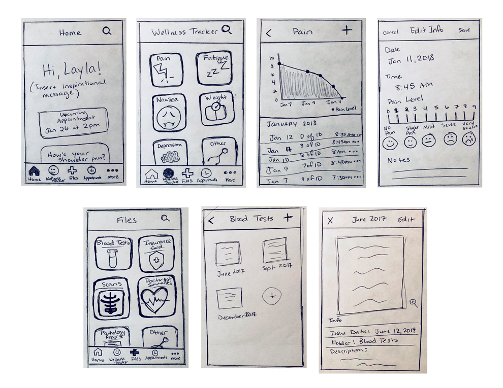
After the user flow, I began drafting wireframe sketches for several pages of Conqr. From these sketches in digitized form, an low-fidelity prototype was built in InVision. Below are the initial sketches and digitized lo-fi prototype.
Initial Conqr wireframe sketches
Some pages of the Conqr lo-fi prototype
UI DESIGN
The last step for this project was the user interface design aspect. After I came up with the name 'Conqr', I created a several different logo drafts. I wanted a logo that conveyed positivity, but was sleek and clean. After much consideration, I came up with the final logo concept below.
Final Conqr logo and its variations
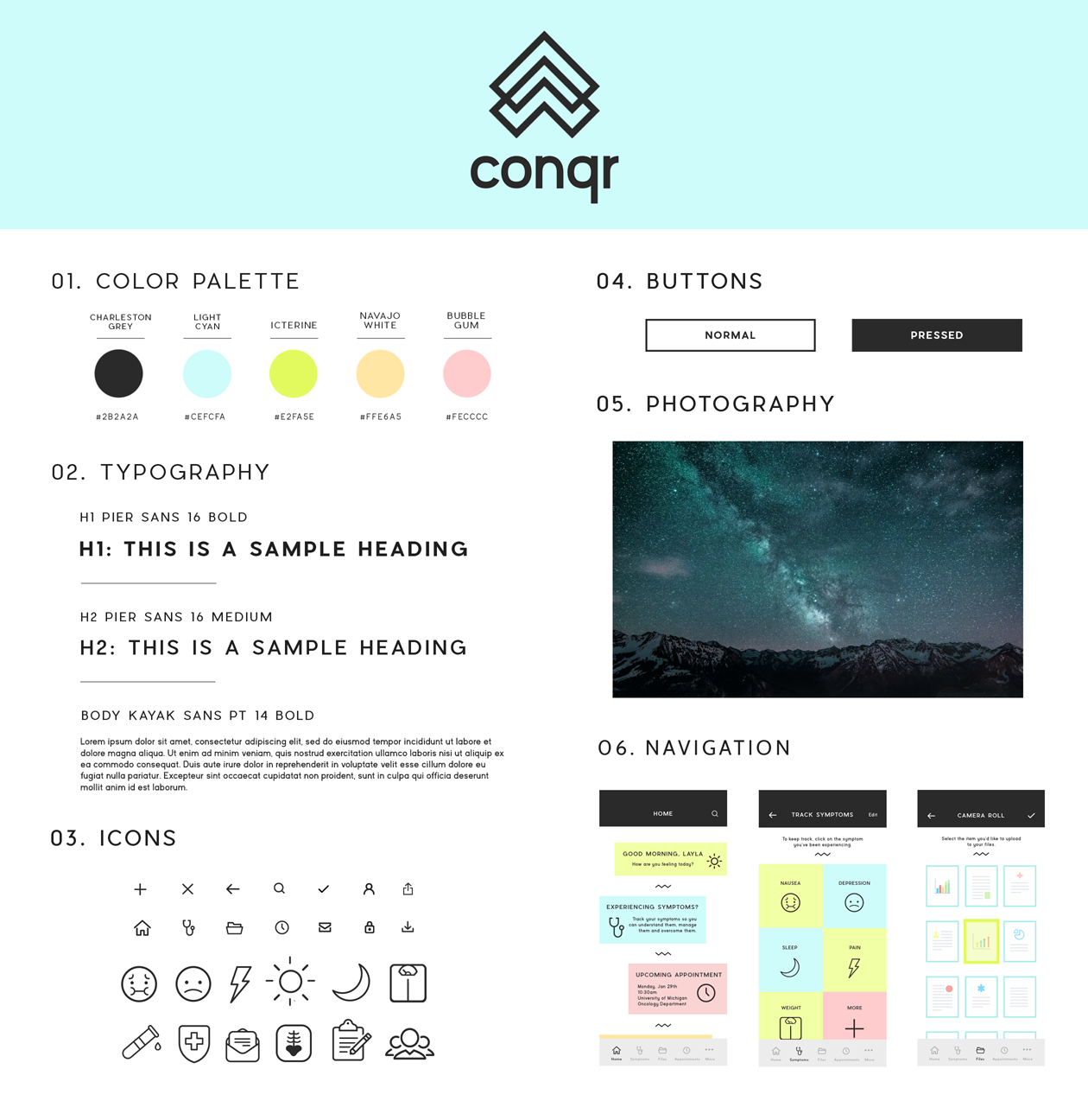
After I finalized the logo, I put together a UI kit. The kit consisted of a color palette that would bring a calming, friendly effect. Typography, buttons, icons, photography, and the navigation were also included in the UI kit.
Conqr's UI kit
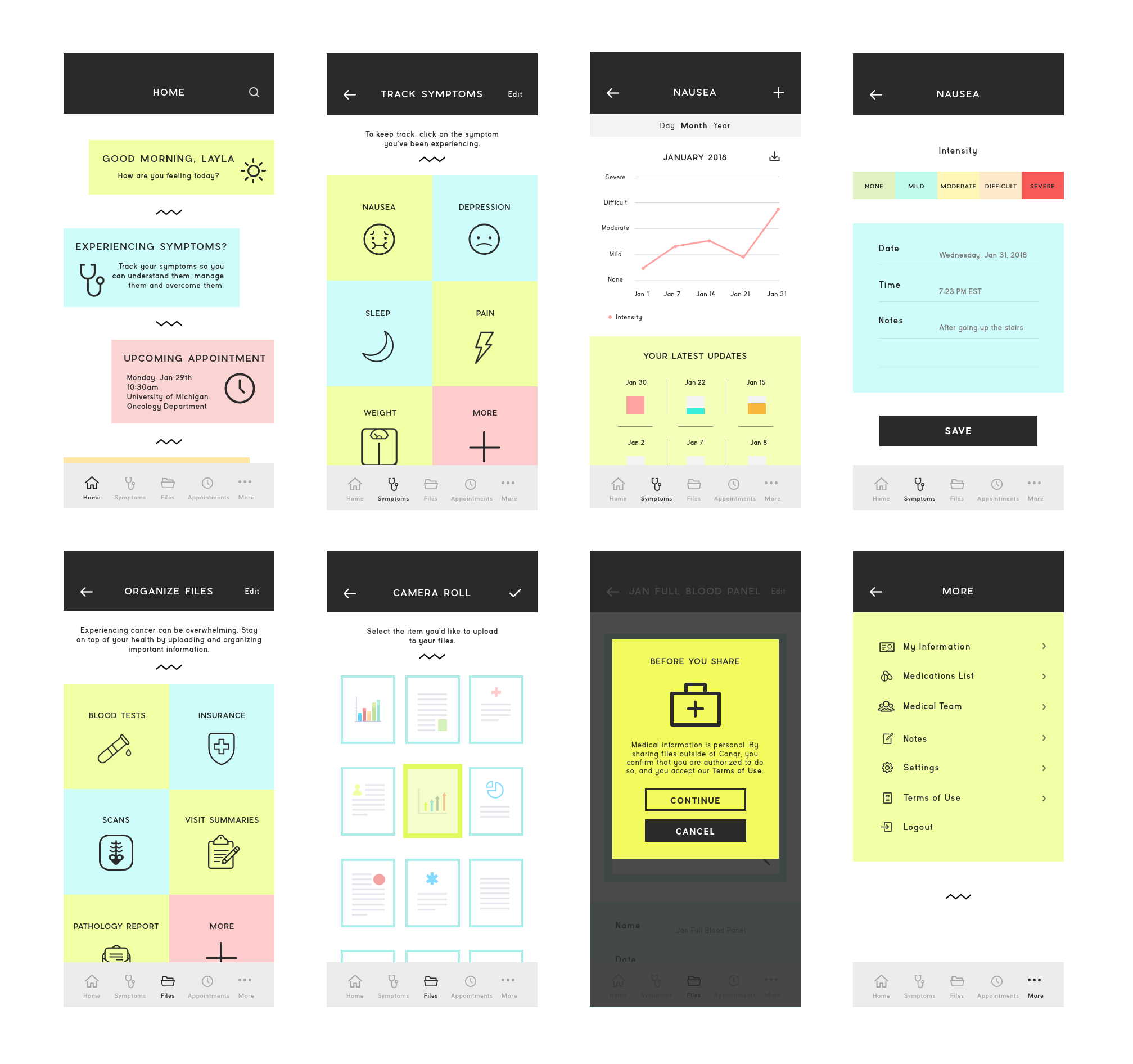
After creating the UI kit, I created Conqr's high fidelity prototype on InVision. Because of the site's simplicity, the prototype shows all functions of the site.
Some pages of the Conqr hi-fi prototype
SUMMARY
I learned quite a lot during this project. Not only did I get immersed in the world of health and medical apps, I also learned about HIPAA compliance and the legal importance of keeping medical files safe and secured.
The research aspect of this project was not only incredibly informative, but moving. I was truly touched by the interviews. They definitely had an impact on me emotionally and they were on my mind throughout the entire process.
Coming up with the name "Conqr" took me a while, and I went through several names before I decided on it. However, I'm happy with what the name represents and the positivity it invokes for the users who are undergoing such stressful health situations.
The feedback from interviews and usability testing was incredibly valuable throughout the entire process. The usability testing in particular opened my eyes to better ways the app can be more accessible and overall useful in the lives of those who need it most.
Although this was one of the most difficult projects I've worked on, I felt it has been the most personally rewarding. This is a topic I'm passionate about, and I hope it can help solve solutions and ease some burdens for those facing cancer.
I look forward to working on more projects like this in the future!


